White Label Design System
Context
Optisantis is a white label brand that built a platform for healthcare insurance companies and their members. The plateforme is filled with basic healthcare app needs such as the monitoring of reimbursements and fees but also has a editorial side that allows users to read up on changes in todays healthcare plans in France.
Need
The product was first created based on the need of one client. After a few year, once the solution was more mature, a few other healthcare providers became interested. Moving from a unique client to multiple clients posed the problem of adapting the solution to multiple brands so that the user didn't feel like they were on another brand's platform.
Result
The finality that was reached was that we needed to transform the existant design system to become white label design system. This would mean that clients could come to us, give us their brand guideline and we could adapt our app to them.
Structure
To start of the white label design system, I created a structure of how the "original DS" would interact with the client adaptations. This means I created a Brand Blueprint that would then take into account each brand when the time came.
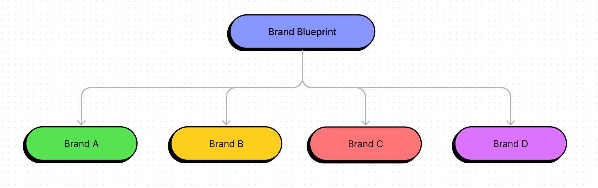
How it works
The brand blueprint is composed of different elements such as :
- Components
- Tokens (font, color, spacing, radius…)
- Icons
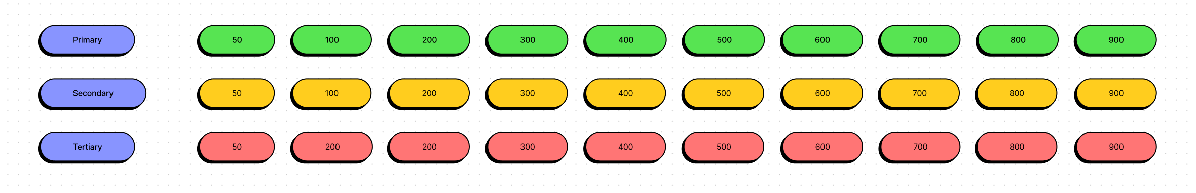
As any other design system, the tokens defined are used in the components of the blueprint brand. Compared to a design system focused on a unique brand, the tokens are created with multiple brands in mind. Colors for example are created with a large number of shade, 10.
Most brand we work with don’t have these many shades per color. This then means our work is to create and add the number of shades missing so that all clients can line up to our Blueprint token rules.