Troops - Design system
Context
TROOPS has an existant design système that was established a few years prior. With new needs from clients and the evolution of the overall product, some elements need to be updated.
Navigation component
The navigation component was a legacy element created at the very beginning of the first version of the TROOPS design system. The architecture of the product was built little by little and needed a serious restructuring.
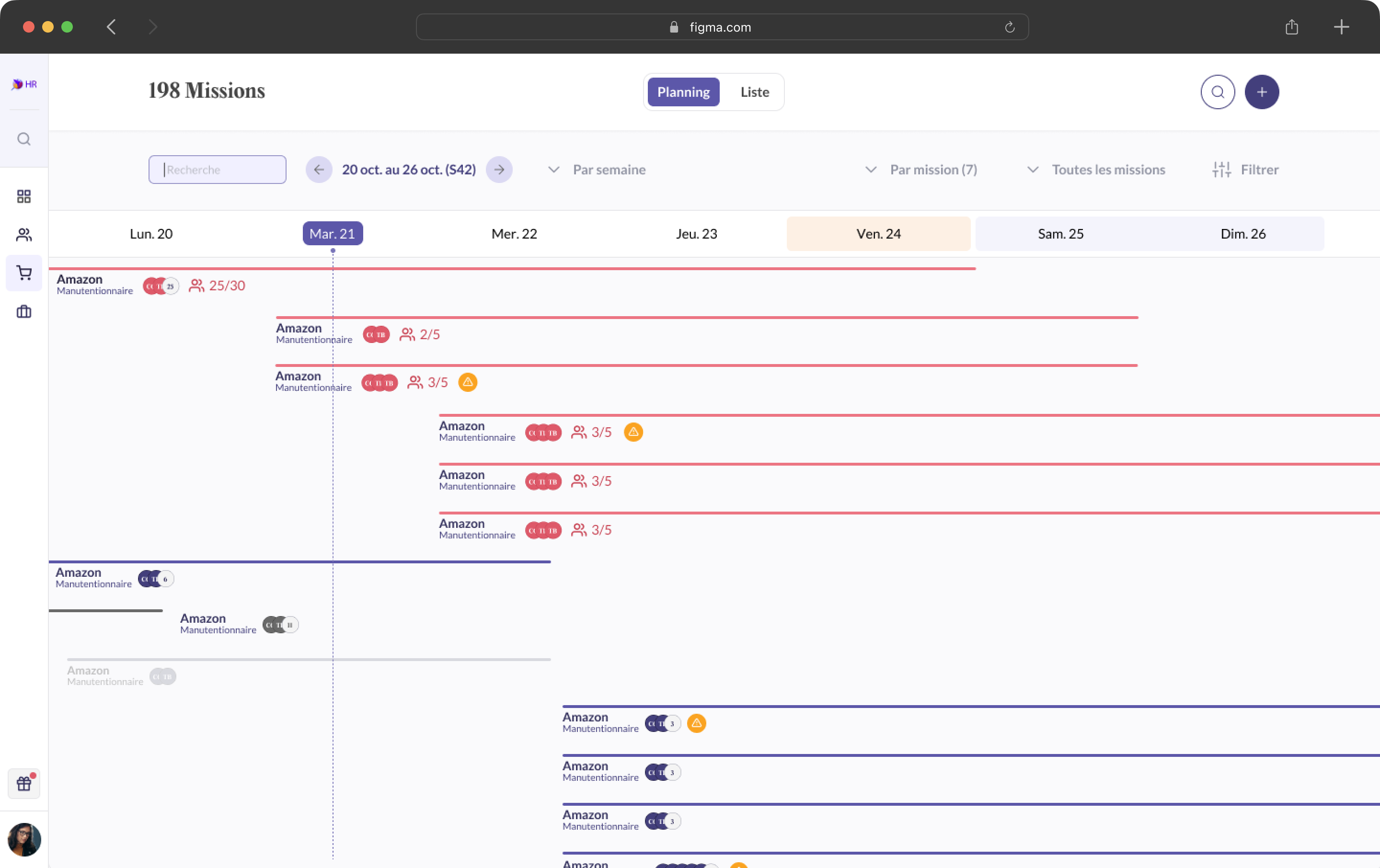
What already existed
The reduced style of the navigation took up quite a bit a screen real estate for what was shown. Section titles were small and complicated to read.
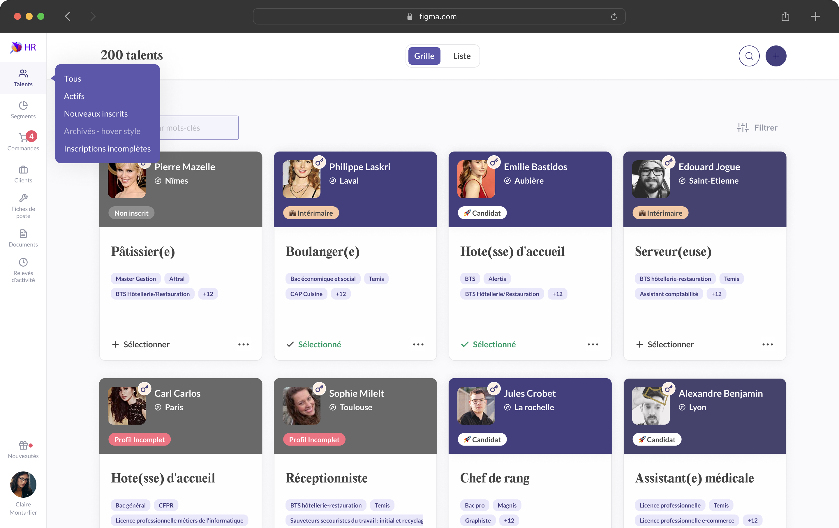
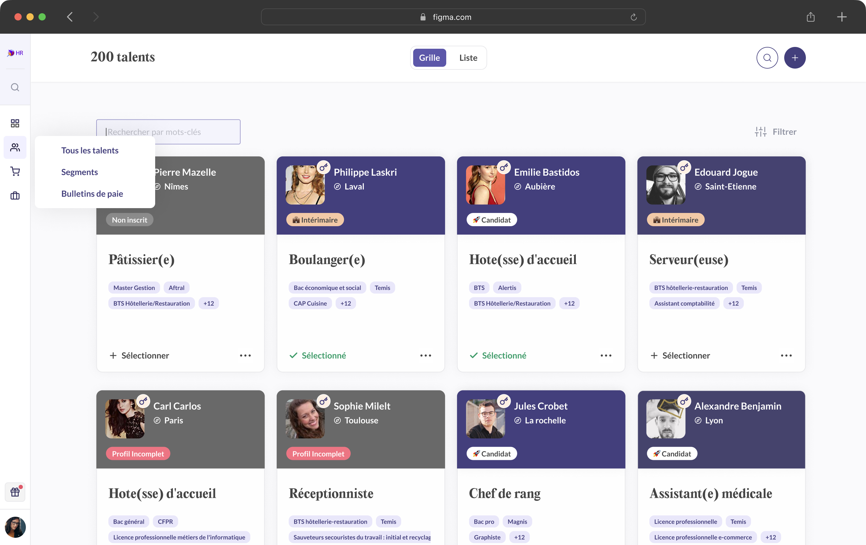
After
A collapsable version of the navigation was created. When collapsed, we use up very little of the screen’s real estate (divided by two from our previous navigation). On the other hand, for users who want to visualise the full navigation, the opened version allows this as all N and N+1 levels are immediately visible.
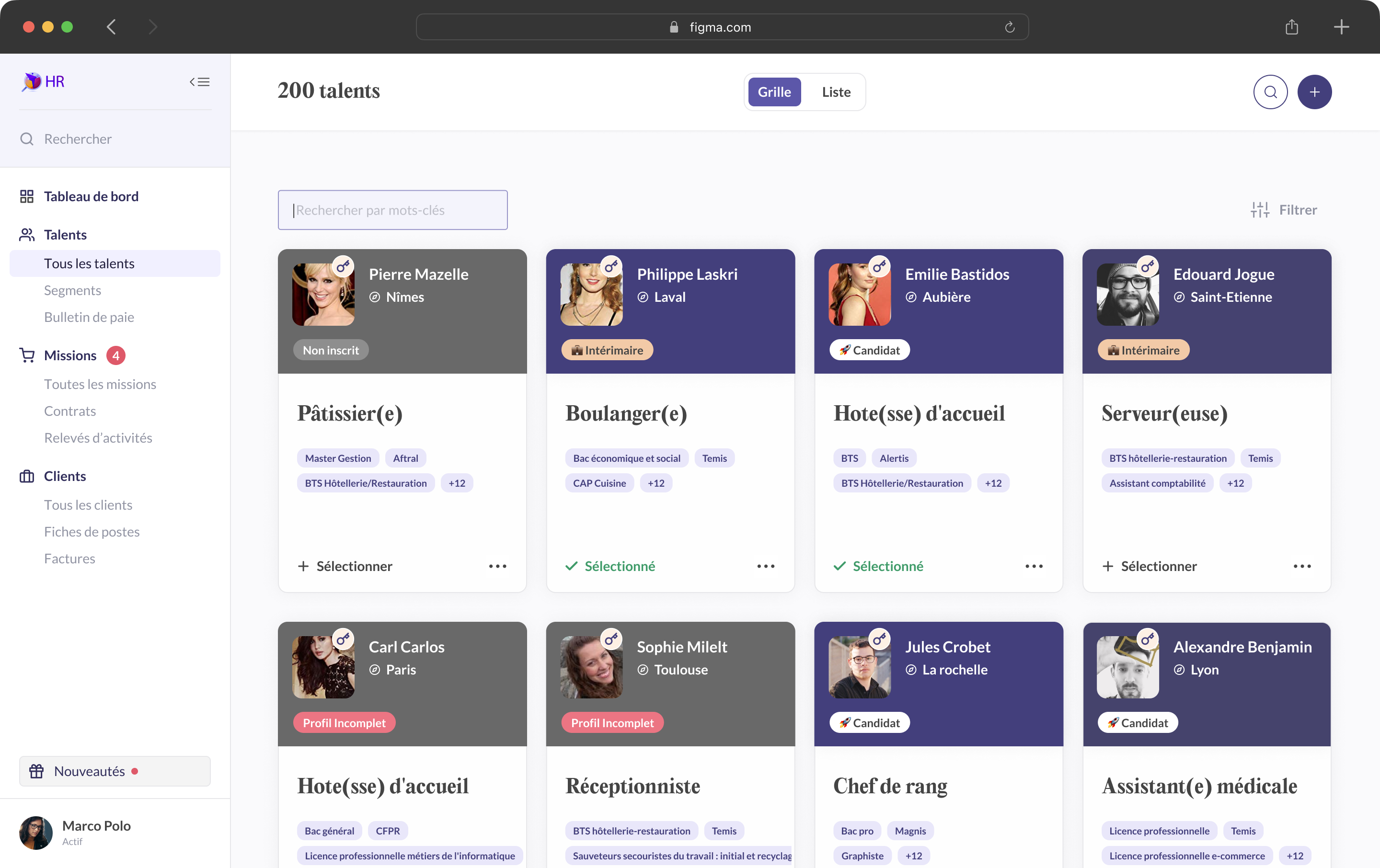
How this allows the product to evolve ?
Once the navigation was updated, it allowed us to push the idea of using up as much screen real estate as possible. To do so, we created layouts that went from border to border. This makes it possible for user with smaller screens to see as much as possible and not feel like they only see half the information at a time.